
The Science Behind a Billboard
A billboard might be one of the most unforgiving pieces of marketing you can design.
Your audience is moving. They may be traveling 45, 55, or 65 miles per hour. They aren’t necessarily looking for your message, and they certainly aren’t going to stop to figure out what you’re trying to say. You have a few seconds to get their attention, communicate an idea, and give them something they might actually remember.
There is nowhere for a bad message to hide.
That’s what makes billboard design so interesting. What looks incredibly simple when you drive past it is actually a lesson in attention, perception, memory, hierarchy, and human behavior.
You Have Less Time Than You Think
When we design something sitting at a desk, it’s easy to forget about the conditions in which someone will actually experience it. A billboard may look great on a computer screen. But that isn’t where the audience sees it. They see it from hundreds of feet away, often while moving quickly and paying attention to traffic. That changes everything. People need to recognize the message almost immediately. If they have to work through a headline, figure out what an image means, search for the company name, and then find the call to action, you’ve probably already lost them. This is why effective billboards tend to have a very clear hierarchy. Something gets noticed first. Something gets understood next. And ideally, something gets remembered.
Your Brain Doesn't Read Everything
People don't process every piece of visual information in front of them equally. Our attention is selective.
Design helps determine where that attention goes.
Size, contrast, placement, typography, imagery, and negative space all influence what gets noticed first. When everything on a billboard is competing for attention, the viewer has to decide where to look. That takes time you don't have.
Good hierarchy makes that decision for them.
The headline might be the dominant element. Or maybe the image does most of the communicating and the copy simply gives it meaning. Either approach can work. The important part is that the elements aren't fighting with each other.
This is also why adding more information doesn't necessarily make a billboard more informative. Sometimes it makes the message harder to understand.
Distance Changes Design
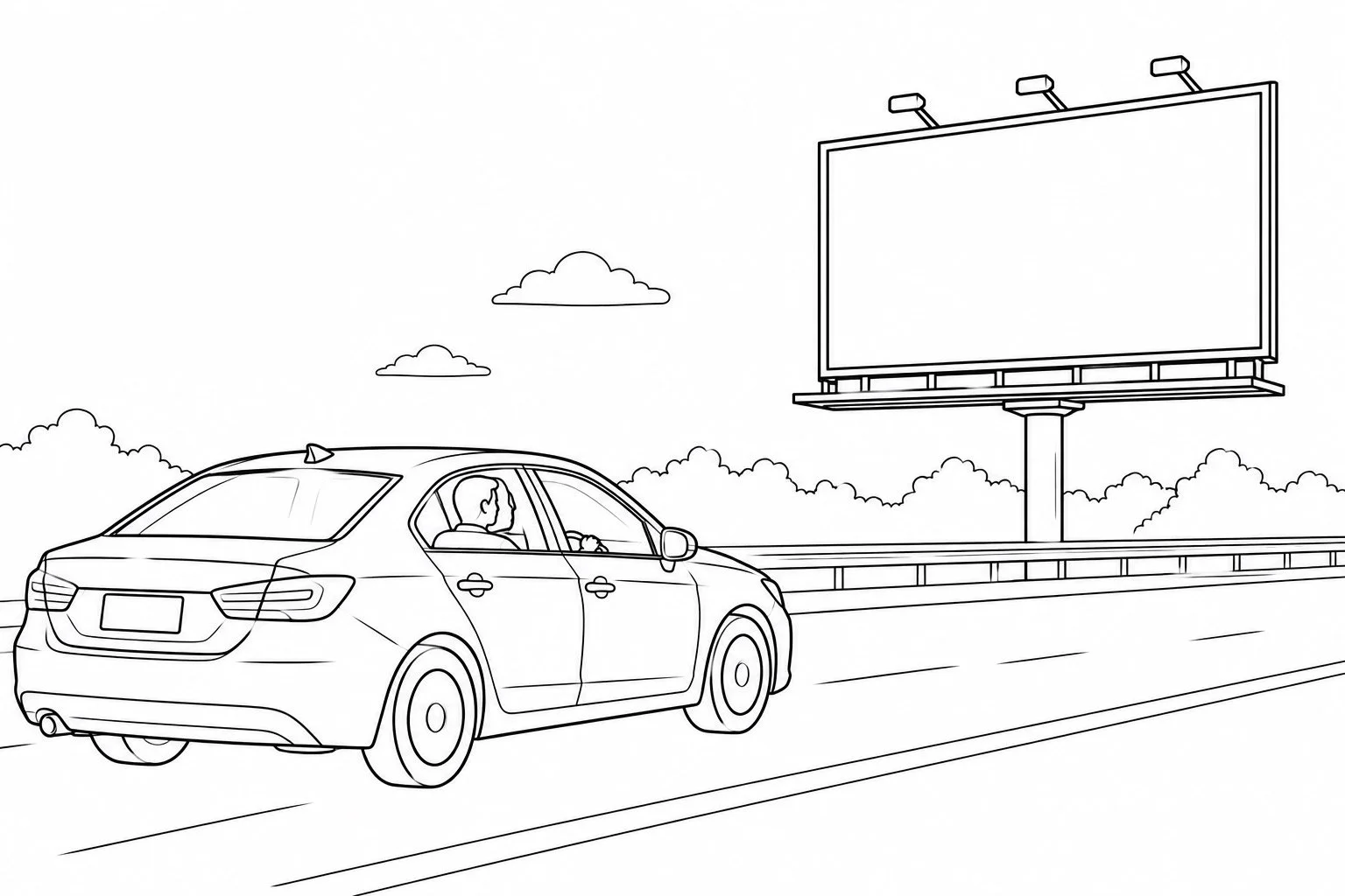
Typography that feels enormous on a laptop can become surprisingly small when it is elevated above a highway. The same is true of logos, URLs, disclaimers, QR codes, and other details organizations frequently want to squeeze into advertising. Design has to account for viewing distance and speed, not just the dimensions of the finished piece. Contrast becomes especially important. Letterforms need to be recognizable quickly. Backgrounds shouldn't interfere with readability. Tiny details that look beautiful up close may disappear entirely from the road.
The question isn't simply, “Can I read this?”
It's, “Can I read this quickly, from where the audience will actually be?”
Those are very different standards.
Memory Matters More Than Information
A billboard isn't a brochure. Someone probably isn't going to absorb your company history, understand three product benefits, remember your phone number, scan a QR code, and process your call to action while driving past. The better question is: What is the one thing you want them to remember? Maybe it's your name. Maybe it's a phrase. Maybe it's an idea associated with your brand. This is where simplicity becomes strategic. Reducing the amount of information doesn't mean you're saying less because you don't have anything to say. It means you're making a decision about what matters most. And making that decision can be surprisingly difficult.
Simple Design Usually Requires More Thinking
One of the biggest misconceptions about simple design is that it is easy. Often, the opposite is true. If you're allowed to put everything on the page, you don't have to make many decisions. When you're forced to communicate one clear idea in a few seconds, suddenly every choice matters.
What can we remove?
What does the audience actually need to know?
Which word matters most?
Does the image help communicate the idea, or is it just filling space?
Will someone understand this without additional context?
Those questions aren't unique to billboards. They're communication questions.
The Billboard Test
This is why billboard thinking can be useful even if you're never designing a billboard.
Look at an email, webpage, social post, presentation, advertisement, or landing page and imagine you only have a few seconds of someone's attention.
What would they notice first?
What would they think you're trying to tell them?
What would they remember?
If the answer isn't clear, adding more probably isn't going to solve the problem.
The lesson of billboard design isn't that every piece of communication needs six words and a giant photograph. Different formats allow for different levels of complexity.
The lesson is that attention is limited.
Good design respects that.
And sometimes the smartest thing you can do isn't figure out what else to add.
It's decide what you can take away.