
You Don't Have to Like Your Brand Colors. Your Customers Do.
At Brillynt Studios, this is a conversation we hear more often than you might expect. A CEO pauses during a creative review and says, "I've never really liked our blue." A marketing leader wonders whether green feels dated, or someone suggests changing the entire palette because another company's colors feel more modern.
We understand. Color is deeply personal. Everyone has favorites, and everyone has colors they naturally gravitate toward—or avoid. The problem is that your brand wasn't created to reflect the preferences of your leadership team. It was created to connect with the people you want to reach.
Brand Color Is a Business Decision
The best brand color systems aren't chosen because someone in the room likes a particular shade. They're chosen because they support the brand's strategy.
Color helps organizations build recognition, create consistency across every touchpoint, communicate personality, reinforce positioning, and differentiate themselves from competitors. When used consistently over time, color becomes one of the quickest ways people recognize your brand—often before they read a single word or study a logo.
Think about some of the world's most recognizable brands. You don't need to see the script to recognize Coca-Cola's signature red. Tiffany & Co.'s robin's-egg blue has become so distinctive it's commonly referred to simply as "Tiffany Blue." UPS spent years reinforcing the idea that brown represented dependability, while Target's bold red has become inseparable from its brand identity.
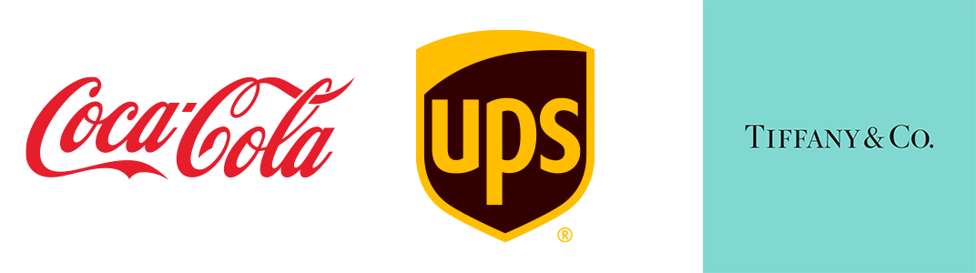
None of those colors became powerful because they're universally everyone's favorite. They became powerful because the organizations used them consistently, strategically, and relentlessly over time. Consistency is what creates recognition, and recognition is one of a brand's most valuable assets.
What About Color Psychology?
Color psychology often enters these conversations, but it's frequently oversimplified. We've all heard the common associations: blue communicates trust, red creates excitement, green represents growth, health, or sustainability, purple suggests creativity or luxury, and yellow conveys optimism.
There is some truth to these associations, which is why you'll notice patterns across industries. Healthcare organizations, banks, insurance companies, and technology brands frequently rely on blue because it often evokes stability, confidence, and reliability. Environmental organizations, nonprofits, and wellness companies commonly use green because it can suggest growth, renewal, or sustainability. Retail and food brands often lean toward red because it naturally attracts attention and creates a sense of urgency or energy.
But these aren't universal rules. Context matters just as much as the color itself.
A deep navy creates a very different impression than a bright turquoise. A muted sage green tells a different story than a vibrant lime. Typography, photography, messaging, illustration style, and the overall visual identity all work together to shape how people perceive a brand. Color supports the strategy—it doesn't define it on its own.
Perhaps even more important, colors develop meaning over time because of the brands behind them. When people see a certain shade of red, they may think of Coca-Cola. A robin's-egg blue may remind them of Tiffany & Co. Those associations weren't built by color psychology alone. They were built through years—sometimes decades—of consistent brand experiences that taught consumers what those colors represented.
Personal Preference Isn't Brand Strategy
The challenge begins when personal preference is mistaken for strategic direction.
We've sat in meetings where someone wanted to eliminate orange simply because they didn't like orange, or replace blue because it felt boring. Those opinions are completely valid as personal preferences, but they aren't business reasons to overhaul a brand identity.
Changing a color palette affects far more than a logo. It impacts your website, social media, advertising, presentations, printed materials, signage, email communications, environmental graphics, and every customer touchpoint you've built over time. It also affects brand recognition, which often takes years of consistent exposure to establish.
Instead of asking, "Do we like this color?" a better question is, "Is this color helping our brand accomplish its goals?"
The Best Conversations Start With "Why"
The strongest client partnerships we've experienced understand this distinction early. Once everyone understands why the brand system was created, the conversation naturally shifts.
Rather than debating individual opinions, leadership teams begin asking more meaningful questions. Does this palette support our positioning? Does it differentiate us from competitors? Does it resonate with our audience? Can it scale across digital, print, presentations, campaigns, and future growth?
Those are strategic conversations, and they almost always lead to better branding decisions than personal preference alone.
Brands Should Evolve—But With Purpose
None of this means your brand colors should never change. Organizations evolve, markets shift, and audiences' expectations change over time. Sometimes a refresh—or even a complete rebrand—is exactly the right decision.
The difference is that successful brand evolution is driven by insight. Research, customer feedback, competitive analysis, organizational goals, and strategic positioning should guide those decisions—not a passing reaction during a review meeting.
At Brillynt Studios, we believe the strongest brands aren't built around what executives personally prefer. They're built around what helps an organization communicate clearly, earn recognition, and build trust over time.
Because at the end of the day, your favorite color isn't the one that matters.
Your audience's perception is.
And that's what great branding is designed to influence